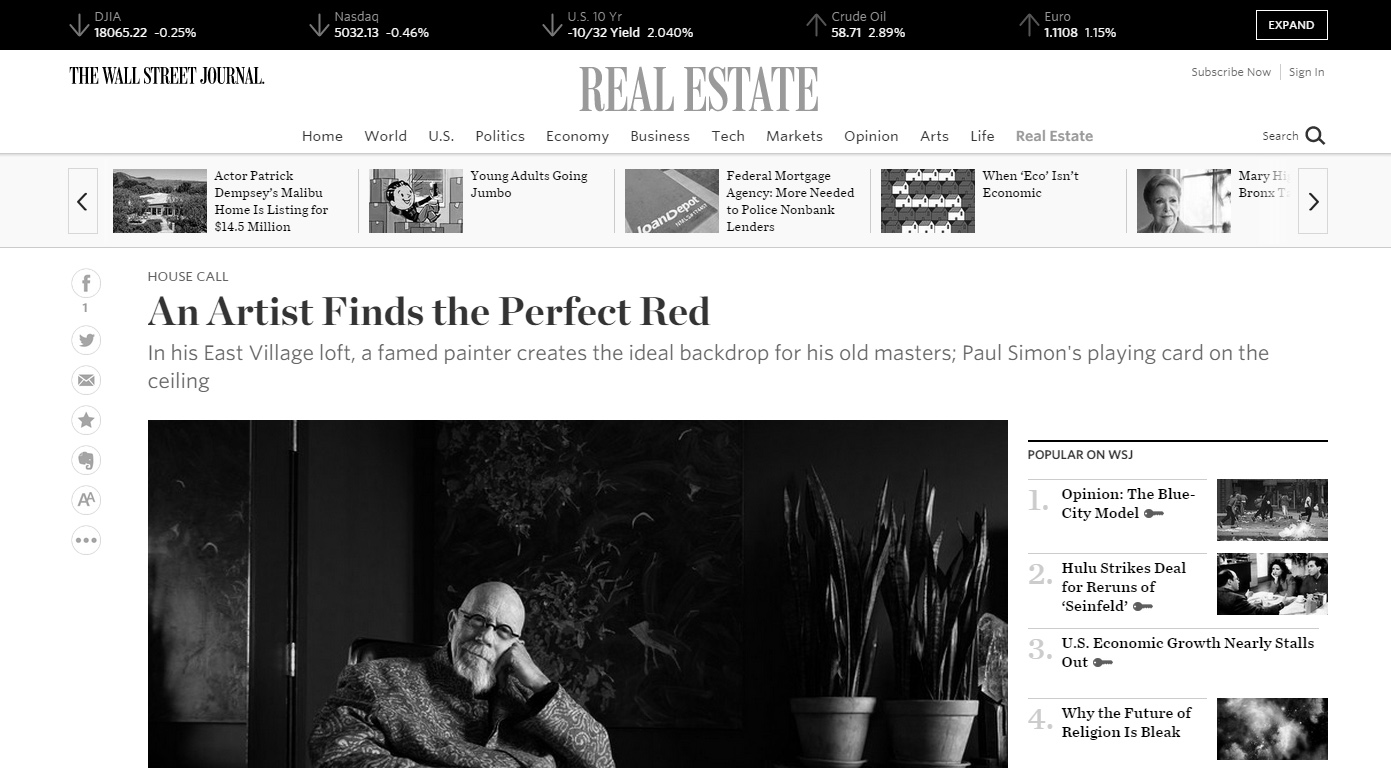
Painter-photographer Chuck Close, 73, is best known for his large-scale, photo-based portraits. His new show—”Chuck Close: Nudes 1967-2014″—is on exhibit through March 29 at New York’s Pace Gallery. He spoke with reporter Marc Myers.
Ever since a spinal blood clot left me partially paralyzed in 1988, I’ve been working from my motorized wheelchair. For years I lived in New York’s West Village, but after my divorce in 2011, I wanted to be closer to my East Village studio. I didn’t agonize over the search. I found a 3,000-square-foot loft nearby, paid too much and moved in.
The four-bedroom apartment is shaped like an “H” and takes up an entire floor of the building. The elevator opens in the apartment at center of the “H,” and when you step out, you’re in a narrow entryway facing a wall. On the wall are three free-standing oak shelves that run 25 feet and are crowded with several hundred framed paintings, drawings, prints and photos by artist-friends. The shelves give me the freedom to reshuffle the works whenever I wish.
Walls painted Cottage Red complement the old masters. ALLISON MICHAEL ORENSTEIN FOR THE WALL STREET JOURNAL
The apartment floors are polished walnut and make traveling from room to room in my chair pretty easy. The ceilings are varying heights—from 12 to 15 feet—and floor-to-ceiling windows provide lots of sunlight and views. On one side of the apartment is a balcony facing north and on the other is large terrace facing south. I collect fine art, so there isn’t much wall space left.
I used to love all-white minimalist spaces. When I moved in, I had the living room painted white, which was perfect for my black-and-white Sol LeWitt paintings and other contemporary pieces. Then I started collecting portraits by old masters from the 1300s to the 1600s. It didn’t take long to realize I couldn’t hang those paintings on white walls. They looked stupid. Visually, white was too harsh a backdrop.
Clearly, I had to find a new color. [Artist] Sienna Shields—who was my girlfriend then and is now my wife—didn’t want to be involved in picking colors. So I went to the Metropolitan Museum of Art and looked at the colors on the walls in the old-masters rooms. I also picked up dozens of Benjamin Moore color swatches and brought them back to the apartment, but none worked. Then one day at Lowe’s, I found a red with a sandstone finish called Cottage Red, by Valspar. The red was totally dead—no sheen at all. Sienna didn’t care for it. She thought the red looked like the color of dried blood.
To test it out, I painted a 4-by-8-foot foam board and put one of my old masters in front of it. The dull red was perfect, but Sienna was skeptical. She said, “Fine, if you’re going to paint the living room red, I want the bedroom black.” I thought for a moment and said, “Sure, I’ll trade you that.”
Sienna went with a greenish black. When the two rooms were done, I actually loved the bedroom and she loved the living room. In the green-black bedroom, the wall-mounted flat-screen TV seems to disappear and our tall green mother-in-law-tongue plants look lifelike. Sienna put up one of her green paintings and it looks so vivid, almost fluorescent. The room even seems larger now, and the dark color puts me to sleep instantly at night.
In the living room, the seven old masters on the walls look at home. The red doesn’t make the space seem like a European drawing room. There’s no crown molding and our furniture is modern, with a carved-wood African bed for a coffee table. We also have a minimalist gas fireplace made of polished gray cement. So the room’s design is still pretty severe—only now it has a warm color that enriches the old masters and our large collection of African sculptures.
From the time I was a kid, I’ve had prosopagnosia—or what’s called “face blindness.” I have trouble recognizing people in person, only when I have a photograph or painting of them in front of me. But when I look at a portrait, I’m less interested in the psychology of the subject. Instead, I see the portrait two different ways: I see the painting’s form—the shape and position of the face—and I see the strokes and colors and how it was done. This riffs back and forth almost like a hologram. I look at a face in a painting and just when I’ve figured it out, it flattens. It’s the push and pull of artificiality and reality. That’s why I hate realism.
In my paintings, I deconstruct a photo image—breaking it into pieces—and create a whole new image. In fact, all artworks that interest me are constructed. They don’t have to be massive works. They just have to engage me. For example, near the elevator, I have an 8-by-10-inch work by Ray Johnson featuring one of his bunny heads in black with “Bill de Kooning” written in white lettering. I also have a portrait of me by Ray. When I asked for an artist’s discount, Ray said, “Of course.” Then he cut the upper right-hand corner to match the price break.
In the kitchen we have a collection of 18 washboards and six welding masks. The masks look like a cross between African masks and Darth Vader. I rarely listen to music at home or in my studio. I don’t like having to work or live to the speed of a beat. I’d much rather find my own pulse and work at that pace. I listen to CNN or MSNBC instead.
Before I painted the living room red, we never went in there. I used to roll through it traveling from the kitchen to the den or the bedroom. Now we eat only in there. The old masters also have changed my perception. Now I notice the reds in the portraits that I hadn’t seen before, as though they had been hiding until the red walls brought them out.
I left the living room’s ceiling white—to give it height. At several recent parties, I invited magician and friend JB Benn. He performed a trick where he asks someone to select a card, sign it and return it to the deck, face down. Then the person shuffles the deck and hands it back to JB, who throws the deck up at the ceiling. Somehow, the selected card sticks to the surface, as if glued.
Paul Simon’s card—the four of spades—is still up there. I have no idea how JB does it. Like art, it’s magic.
– THE WALL STREET JOURNAL